
There’s a new CSS property available that I’m pretty excited about. Traditionally, if you wanted to size an image to be widescreen, you’d have to do some math on your own. Then making it responsive gets tricky as well. Widescreen is 16:9, so if it’s 1200px wide, how tall should it be? On mobile, when it’s now 500px wide, how tall should it be? I’m not going to do math here, since the new aspect-ratio will take care of it for me!
What’s an aspect ratio?
An aspect ratio is a ratio between the width and height of something, noted as width:height. For example, 1:1, is square, it’s 1 unit wide and 1 unit high. It doesn’t actually define the size, just the shape of it. Another example, 2:1 would be 2 units wide, 1 unit high. This would appear twice as wide as it is tall.
For the examples in this post, we’ll be working with:
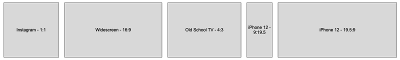
- Instagram photos are 1:1
- Widescreen video is 16:9
- An old school TV is 4:3
- iPhone 12 portrait is 9:19.5
- iPhone 12 landscape is 19.5:9
A little visualization of what aspect ratios are:

Enter the aspect-ratio CSS property
It’s super simple to use:
.widescreen {
  aspect-ratio: 16/9;
}
Done! That’s it!
But wait, there’s more:
Specify your width or height
This is really important to keep in mind. Remember, the aspect-ratio is a shape of the box, not actual dimensions, so your box needs dimensions. Most browsers will size almost anything it gets, and chances are your boxes are already sized (rarely are boxes sized by the browser sufficient for a web design 😚 )
If you specify a width: 200px then your box will be 200px wide, and the aspect-ratio will set the height for you. For example:
Each of the above has only the width set, and then the aspect-ratio is specifying the height. I ❤️ how simple this makes shaping our boxes!
.widescreen {
  width: 200px;
  aspect-ratio: 16/9;
}
See, no math! We don’t have to determine the proper height of any of these boxes. But if you’re curious, at 200px wide, these boxes’ heights are 200px, 112.5px, 150px, 433.3px, 92.3px.
If you specify a height: 200px, then your boxes will be 200px tall, and the width will adjust automatically based on the aspect-ratio, as seen here:
.widescreen {
  height: 200px;
  aspect-ratio: 16/9;
}
Specify only one: width or height
Makes sense, right? aspect-ratio provides us the ability to have the box shape itself based on one dimension. If you provide both, then what should it do? Chrome at least defers to the height and width by ignoring the aspect-ratio. I suspect this will be the standard.

Yea, pretty useless 😆
.widescreen {
  width: 200px;
  height: 200px;
  aspect-ratio: 16/9;
}
One more thing, there’s also an aspect-ratio for your media queries
All of the above is new, this little piece is not new. There is a @media feature for aspect-ratio (yea, spelt the same):
.logo {
  border: 1px solid #333;
}
@media (aspect-ratio: 16/9) {
  .logo {
    border: 2px solid #f00;
  }
}
I know, ridiculous CSS above.
We all know @media queries from writing responsive CSS, and the aspect-ratio feature is just another option! You can use the aspect-ratio feature to apply different CSS to your elements based on the aspect ratio of the viewport. This can certainly be useful when working on mobile devices and you want to handle when the user turns their phone to landscape view.
I’m not going to go deep into this one, as it’s been around forever (eesh! even IE9 supports it). Learn more about it on the MDN web docs here.
Can we use aspect-ratio?
Great question. The CSS property aspect-ratio is brand new for 2021, so it’s not fully baked yet. From what I’m seeing as I write this, it’s in draft form and only Chrome and Edge have fully adopted it. Check out the browser compatibility for the latest.
Does that mean we shouldn’t use it? Well, it depends. I’m on a project where a high majority of users (like ~90%) are using Chrome/Edge, and then the next popular browser is Firefox (which partially supports aspect-ratio). IE and Safari are not supported by our app anyway. We could use it. If you’re creating websites for the wild wild web, then maybe you shouldn’t, or have some good handling in the event a non-supported browser shows up <shudder />.
I’ll keep an eye on it and update this post when it’s more broadly available.
Some aspect-ratio References
For your reference:
What did you think?
Please don’t hesitate to leave a comment below or connect with me on Twitter about this content. I’m always looking for feedback and love collaborating!
Interested in receiving content like this right in your inbox, subscribe below!

 David Lozzi
Leave a Reply