If you haven’t seen, at the start of COVID I created this neat little virtual happy hour app. I got to the point where I wanted to start spicing up the interface some (still a long way to go). I wanted to move away from a list view of conversations to something that illustrates people standing in circles or sitting around a table.
In this example, let’s say we’re having a happy hour for Star Wars fans, and we want to have discussions based on the 3 groups of the movies: Prequels, Originals, and Sequels.
Previously, the list view looked like:
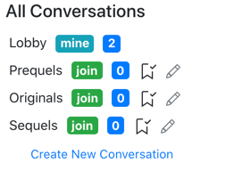
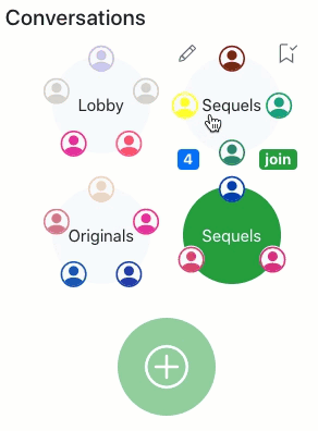
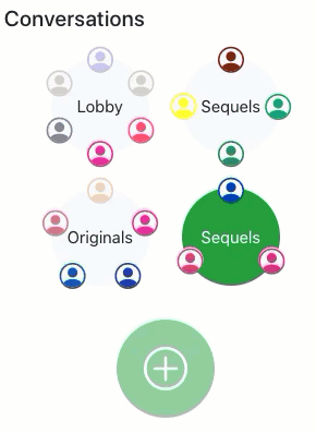
Meh, not terrible but rather boring. As I mentioned, I wanted to spice it up a little:

Nicer isn’t it? I’m not a designer, so I still have a long way to go, but it’s progress.
What’s really neat, is as people move around, it animates too!
😮
I started down this road, googling a lot, and found some really old examples on how to do this. I then reached out to my team and my colleague Josh (yes, the same one that helped through some of the AoC challenges) stepped up and figured out how to best do this. He’s great! THANK YOU JOSH! After he provided the vanilla JavaScript and CSS version, I ported it into my ReactJS app.
Let’s see what he built:
Animating in circles with JavaScript and CSS
Here’s his example, this is also available on his codepen.

The HTML
Uber simple HTML for this:
<div class="circle-container">
  <svg viewbox="0 0 64 64"><circle r="28" cx="32" cy="32" class="circle"/></svg>
  <ul>
  </ul>
</div>
As you can guess, most of the magic is going to happen in CSS and JavaScript. The svg is the circle object we see and the ul is the container for the circle.
The CSS
html, body { margin: 0; padding: 0; height: 100%; font: 100%/1.2 Helvetica, Arial, Sans-serif; }

.circle-container {
	position: relative;
	display: flex;
	place-items: center;
	width: 50vw;
	height: 100%;
	margin: 0 auto;

	svg {
		position: absolute;
		top: 50%;
		left: 50%;
		transform: translate(-50%, -50%);
		z-index: -1;
	}

	.circle {
		fill: none;
		stroke-width: 3px;
		stroke: #fc0;
	}

	ul {
		list-style-type: none;
		margin: 0;
		padding: 0;
		position: absolute;
		top: 50%;
		left: 50%;
		transform: translate(-50%, -50%);
	}

	ul > li {
		display: block;
		width: 2rem;
		height: 2rem;
		border: .5rem solid #fc0;
		background-color: #fff;
		text-align: center;
		line-height: 2rem;
		border-radius: 50%;
		position: absolute;
		top: 0;
		left: 0;
		transition: transform .5s cubic-bezier(.5, 0, .35, 1);
		transform: translate(-50%, -50%);
		transform-origin: center center;
	}
}
Nothing too crazy here. A few things to pay attention to:
- When setting the
topandleftto50%, that puts the object’s top left corner into the center (vertically and horizontally). To put the center of the object into the center, we thentransformit bytranslateing it by a-50%. Neat little trick. - Then in the
ul > li, we have added atransitionwhich will give an animated experience. Anyliunder theulwill be positioned in the center of the circle.
Now for the fun part…
The JavaScript
(el => {
	const TIMER = 500;
	const minItems = 1;
	const maxItems = 20;
	let direction = 1;
	const distance = '12rem';
	let currentItems = 0;

	// Reset the rotation of the elements in the list
	const resetRotation = n => Array.from(el.children).map((li, idx) => {
		const rot = idx * 360 / n;
		li.style.transform = `translate(-50%, -50%) rotate(${rot}deg) translateY(-${distance}) rotate(-${rot}deg)`;
	});

	// Remove an item from the list
	const removeItem = () => {
		el.lastChild.remove();
		currentItems--;
	};

	// Add an item to the list
	const addItem = () => {
		currentItems++;
		const newLi = document.createElement('li');
		newLi.innerHTML = currentItems;
		el.appendChild(newLi);
	};

	// Logic to handle the number of items in the list
	// if < max, add one, > min remove the last one
	const manageItemList = () => {
		if (currentItems < maxItems && direction === 1) {
			addItem();
		}
		else if (currentItems > minItems && direction === -1) {
			removeItem();
		}
		else {
			direction = currentItems === minItems ? 1 : -1;
		}

		resetRotation(currentItems);
		setTimeout(manageItemList, TIMER);
	};

	manageItemList();

})(document.querySelector('.circle-container ul'));
What to pay attention to here:
manageItemListis what adds and removes items from the circle. Later you’ll see React handles that differently, but for this example, this adds up to 20 items, one at a time every 500 milliseconds, and then removes them.addItemandremoveItemare basic DOM operations using theul.- The fun comes with
resetRotation. This is what determines the location of every item around the circle. This loops through eachliand updates itstransformstyle. These 4 commands trigger in order:translate, keeping the original CSS setting we hadrotateit to the right degree, based on the number of items. This ensures they all fit evenly.translateYto move it around the circle, remember it’s rotated aboverotateagain to rotate the object so it’s legible, otherwise we’ll get text looking like:

That’s it! Not a lot of code at all. Again, you can check it out and play with it at Josh’s codepen.
Animating circles in ReactJS
With the awesomeness from above, I then had to port this into ReactJS. In my app, as people go from conversation to conversation, I need to dynamically add and remove them, and animate it.
Given the nature of software development, this code may have changed by now, you can see whatever approach I’m currently doing in the source code itself for Virtual Happy Hour on github, or see it in action at Virtual Happy Hour. Enjoy!
The HTML
In my render of my component, I have this snippet of code
<div className={`circle-container convo${convo.convoNumber}`}>
<ul>
  {participantList.map((p) => (
    <li >
      <ParticipantIcon participant={p} />
    </li>
  ))}
</ul>
The containing div here has to be unique on the page, since there are many conversations occuring at once, so we have unique class names by appending the convoNumber to the class. We should have a unique circle per convo, something like convo1, convo2, and so on.
You’ll see a ul and then a map on my array, each rendering a li. ParticipantIcon which is that little person looking icon.
The CSS
My CSS is using a compiler so the syntax will look a little different than typical CSS
.circle-container {
    position: relative;
    display: flex;
    place-items: center;
    width: 90px;
    height: 90px;
    margin: 15px;
    background-color: $light;
    display: flex;
    justify-content: center;
    text-align: center;
    border-radius: 50%;

    ul {
      list-style-type: none;
      margin: 0;
      padding: 0;
      position: absolute;
      top: 50%;
      left: 50%;
      transform: translate(-50%, -50%);
    }

    ul > li {
      display: block;
      width: 1.5rem;
      height: 1.5rem;
      background-color: $light;
      color: $white;
      font-weight: bold;
      text-align: center;
      border-radius: 50%;
      position: absolute;
      top: 0;
      left: 0;
      transition: transform .5s cubic-bezier(.5, 0, .35, 1);
      transform: translate(-50%, -50%);
      transform-origin: center center;
    }

    .person {
      font-size: 24px;
    }
  }
Very similar to Josh’s CSS, other than my style changes and sizing to make it work for my page. You’ll see the same transitions and transforms.
The JavaScript
My JavaScript obviously isn’t using vanilla JS since we’re in React.
  React.useEffect(() => {
    setTimeout(() => {
      room.conversations.forEach(convo => {
        const participantCount = room.participants.filter(p => p.primaryConvoNumber === convo.convoNumber).length;
        const el = document.querySelector(`.circle-container.convo${convo.convoNumber} ul`);

        Array.from(el.children).forEach((li, idx) => {
          const rot = idx * 360 / participantCount;
          li.style.transform = `translate(-50%, -50%) rotate(${rot}deg) translateY(-2.7rem) rotate(-${rot}deg)`;
        });
      });
    }, 150);
  }, [room.conversations, room.participants]);
Here’s what I got going on:
- I’m using a
React.useEffectso that any time theconversationsorparticipantschange on theroom, we will reassess and move people around as needed. - I get the
participantCountfor the currentconvo - I am using
document.querySelectorto get the circle associated with this conversation, instead of usingReact.useRef. I went down theuseRefroad but found it unnecessarily complex and added some bloat. Since I am working with pure UI treatment and didn’t really need to do anything with it, I deferred to this easier, cleaner approach. Disagree? Let me know below! - Finally, the little block of
Array.fromcode is much like what Josh had provided. We then iterate through eachliin the circle, setting their new location via theirtransform. - Since React is controlling my DOM, I don’t need to add or remove
liitems manually as we saw in Josh’s example. Instead, React will add new DOM elements as we add items to the array. Items are added elsewhere in my app.
That’s it!
With this little block of code, we’ve moved from a boring list to cooler circles and the icing on the cake is now as people jump conversation to conversation, we can actually see them jumping around!
What do you think? How might you do this differently?

 David Lozzi
Really helpful and insightful , keep sharing such awesome content.
Do check subscribe my blog , Dossier
Learn about Machine Learning, Artificial Intelligence, Data Science, Web Development, Mobile App Development and other strategies to build a successful career in tech.
Link :- https://tushirnitin.wordpress.com/
LikeLike