

As it stands today, Microsoft Forms is quite limited in its customization capabilities: with changing the background to a custom image only being released in recent weeks, you can select a theme or create your own. Forms will continue to grow and adapt and will eventually offer the necessary level of customizations we need. I hope it will eventually compete against the likes of SurveyMonkey, TypeForm, and others.
What’s available today?
Consider the following form:
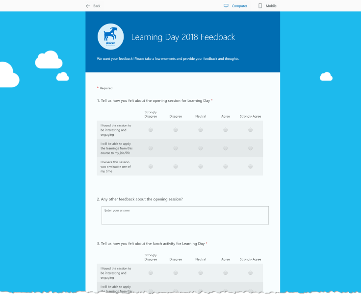

I used one of the fun backgrounds and set the header image, that’s about it. My problem is that this survey is 20 questions, and in this format, it gets little monotonous.
Below are some tricks I used to help make the form feel a wee bit easier to digest.
Adding Paging to Forms
Paging isn’t available in Forms yet, but we can fake it out. One of my colleagues (Venetia, she’s not even an O365 expert) showed me this one. Users can be so resourceful!
One trick she showed me is to use branching on questions so the user can answer a few, then the next set appears. Instead of overwhelming the user with all 20 questions, we can provide them “pages” of questions at a time.


I can set all the options to go to the same question, which is just the next question. Setting Forms branching like this causes the next question, and subsequently all following questions, to be hidden. Any answer I select will have question 10 appear, and giving the users a feel of progressing without really knowing when the fun will end.
Adding Images to Questions
In an attempt to continue to help the long form feel, I thought adding images to questions would help. Something to break up the content will help.


Sadly, this didn’t help as much as I would’ve hoped. The image sizes are huge, as shown above, that image is “small”. Selecting the large option consumes over half of the space. That wasn’t going to work for me, too much space lost, but maybe that’ll work for you!
However, there was a side effect of adding an image.
Formatting Questions
When you add 1 image to 1 question, the entire form reformats. It goes from the first image I shared above to something like:


Note the questions! They’re colored, formatted differently. Immediately this form feels better. I can see the questions, my eyes are naturally attracted to the questions as I walk through the form.
But I have to include a huge image on a question to get this to work. So, let’s do that! The hack here is to then SKIP that question, so the user NEVER sees the big image in your survey. Yes, really!
I added a new question to the bottom of the survey and threw an image into it.


Then, using Branching, once the user gets to the final question of my survey, before this empty question, I set it to go to “End of the form”.


Question 21 never appears, never shows to the user, but I get the benefit of the formatting!
That’s it!
If you’re using tricks to improve Forms, let me know below! I’m a fan of this tool, but it has a long way to go before it’s as enterprise ready as we’d like. Check out some of my other Form posts here.