
Microsoft PowerApps is a great “no code” solution for creating customized forms for SharePoint Online and independent web apps and mobile apps. However, it can get unruly inside of an app if you don’t follow some sort of guidelines and practices. After you get a few screens in with dozens and dozens of controls, you may feel out of sorts, a little lost. If you invite someone into the party to help in the app, they will also feel dazed and confused.
Below I’ll walk through some best practices for managing controls within PowerApps. These simple tips can help streamline your app making efforts by giving you and your app a sense of consistency and sanity.
Am I missing something? Leave a comment below and I’ll check it out!
Colors, styles, and layouts of controls
As you venture into dropping controls into screens in PowerApps, you’ll see a long list of properties for each control, and each property having its own value. This is great, lets you customize almost anything, but it can get out of control quickly. As you realize that you want to change a font or color, you now have to manually go to each control and change it. This isn’t fun.
Instead, you can create a style sheet, and define all the values you want once, then set all of your controls to pull their styles from this style sheet. This is a HUGE win because designs change, look and feel change (have you ever worked with end users? Never mind designers [love you all]). Or if you’re just working on your own, the more time you spend in the app, the more you’re want to change things. If you don’t build your app on a style sheet, then one little change like a font color, or title color, or a button font, becomes a tedious task of scraping the entire app for those controls, and updating them everywhere. Then testing it all out to make sure you got them all. Ug..
How do we do this? I’ve covered the details in another post, you can read here: Custom Style Sheets for PowerApps.
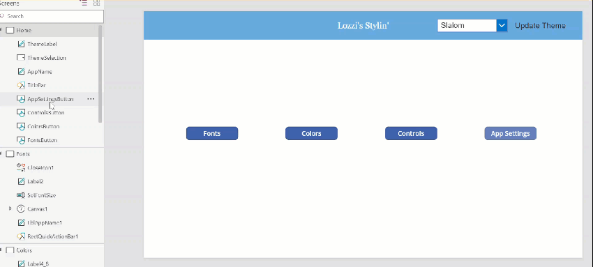
Name your controls
As you drop controls on the screen, they get super generic names, like button1, label1, gallery1, etc. It’s really simple to name them, just double click on them in the left nav:

Why do we care? As you type in the function boxes in PowerApps, a menu drops down, also known as intellisense, that gives you options for what you’re typing. So as you engage your controls (especially in the next step) having a common naming system in place helps you speed up your efforts. Also, naming helps you find objects later, and helps others who may come in and edit your app better understand what’s going on.

The name of your control has to be unique across the entire app and can’t be the same name as anything else in the app, like variables, data sources, images, etc. Don’t worry so much about naming each and every label. Name the bigger controls, like galleries, screens, and any control that you’ll have other controls dependent on (see next tip).
Consider naming the controls with identifiers to the screen you’re on. For example, if you’re on Home, prefix your controls with Home_Title1, or Hm_LogButton, then other screens would have Lg_Title1, Rd_Title1, etc. This will make it easier for you to find those controls.

Depend on other controls
As you build a big screen full of controls, sometimes adjusting the layout can be a pain:

One way around this is to use a style sheet (see first tip above), where you could set layout properties for every control, but that’s a whole lot of work (this will be easier).
Instead of using the style sheet, you can set the properties of your controls to the values of other controls. Eh? For example, I can set label1.X to the same as label2.X. Now when I move label2, label1 gets updated automatically. Nifty right?
You can also set it so label1.X is set to label2.X + label2.width + AppLayout.ControlPadding. (AppLayout is my style sheet I made, again see first tip. Alternatively you could just put in number like 100.) This will keep label1 always to the right of label2, with a little padding between them. And again, when we move label2, label1 will faithfully follow:

In this example, I set the X property of the App Settings button to ControlsButton.X + ControlsButton.Width + 150, then the Y property to the FontsButton.Y. I set the ControlsButton.X to ColorsButton.X + ColorsButton.Width + 150 and the Y property to FontsButton.Y. And so on. Each control inheriting from the next.
As you might imagine, the Name your controls tip above comes in handy here…
You can also set all of your screens’ controls (that repeat) to depend on the home screen controls. If you have a title label, and it’s the same label across all screens, you can set all of your screens’ title controls to use the X, Y, color, font, etc. of the home screen title. If you move the home screen title, then all the subsequent screens’ titles will move too!
Once you have that first screen setup, you can quickly create additional screens’ layouts by…
Copy and paste as much as you can
When you copy and paste, just use CTRL+C and CTRL+V, you can copy a control anywhere else in the app.
This is a great way to start your newly added screen. Copy the title and button controls from the first screen and simply paste them into the new screen.
When you copy/paste, the control and all of it’s properties come along with it! So, before you copy, make sure you set your style properties, naming and control dependencies because it will all copy with it. The only slight difference is that the control name will change, PowerApps will append _1 to the control name.
 Hold CTRL key and click to select multiple controls.
Given just the name changes, you can quickly create additional screens and functionality by copy/paste, and maybe then tweak 1 or 2 dependencies, if you want.
That’s it for now!
These are the core tips I highly suggest when working in PowerApps. I’m sure more will come, but for now, Happy PowerApp’n!
 RSS - Posts
The stylesheet is a great idea, it really helps with having a unified app.
As for aligning the controls, it’s also good idea to have them defined in a Gallery. I’m still experimenting with this approach, but this seems to simplify the customization and keep alignment.
Another idea, I would add is to have the measurements defined as % of the app/screen size. Or if it’s a nested control (like inside a gallery or group), you could use the parent.width / parent.height values for setting these. This way the look of your app will be the same across devices.So for me, padding would be like 1% or maybe 2% of the screen size.
Thanks for the tip! I’ll check that out! Let me know how it goes!
So, here’s what I’ve figured out so far:
1. Insert a blank gallery.
2. Add the control you want to use. I was using it for buttons, or even creating a tab strip with buttons.
3. Configure your control the way you want (size, color, position inside the gallery, etc.)
4. Define your items. I used table for this one and build on what David suggested for pseudo CSS. But you could set up an Excel table, Sharepoint list, whatever you fancy. In the latter cases, it is easier for any user to update the look of your app.
Table(
{ButtonLabel: “Button1”, FillColor: colColors.PrimaryGreen, Screen: scrNew},
{ButtonLabel: “Button2”, FillColor: colColors.PrimaryBlue, Screen: scr2},
etc.)
The critical point here: if you want to use your buttons for navigation, then you should have a column which defines the Screen, where you want to navigate and call it Screen. All other columns can be called anything, but if this one is not called correctly, than it will not work. In this case, it will be seen by the system as a Screen item.
5. Assign the parameters to your control:
OnSelect: Navigate(ThisItem.Screen)
Text: ThisItem.ButtonLabel
Fill: ThisItem.FillColor
This way, you have only one control: less complexity, easier updates.
And I’ve also seen a youtube video, where the gallery size and the layout of buttons change dynamically depending on the number of items: https://www.youtube.com/watch?v=vGVFQZ_Rxkg&t=252s
Great article! One further recommendation to keep related controls aligned is to use grouping. The following post (not mine) outlines grouping controls: https://veenstra.me.uk/2018/03/19/powerapps-grouping-fields-on-forms/
Also, Microsoft has posted a white paper (after your post) that includes best practices and standards for Canvas Apps. It includes a lot of details on their recommended naming standards:
https://aka.ms/powerappscanvasguidelines
Microsoft recommends prefixing control names with a type (e.g. btnHome, txtUserName, lblLastName…)
Thanks!
I like grouping as well, but the lack of ability to add items to an existing group makes it unmanageable to actually recommend. However, his blog post isn’t referring to the actual group capability. His technique I share above as well.
Thanks for the share on this MSFT document. Looks promising!
i LOVE this article!!
Do you have any more pointer on how to make our lives eassier (developers I mean)?
Thanks!! Check the Office 365 menu above, PowerApps page Ba Flow have more on them.