
Yes, CSS for PowerApps, kinda. Actual CSS based style sheets are not possible, but the next best thing is. We can create a few objects to store our styles in, like colors, font sizes, dimensions, etc. and then reference them across the app. Not really cascading style sheets, but let’s call them just style sheets. ;)
Create the style sheet in PowerApps
To create your style sheet, you’ll want to create a new object and then set it’s properties to your your styling values. I suggest a different object per group of properties. This will help you later, as well as other users who want to modify the app.
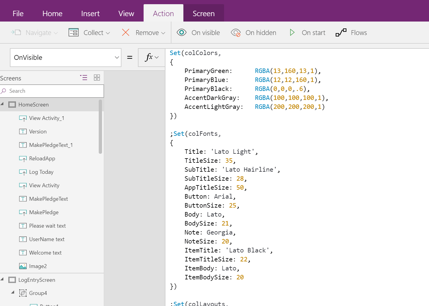
Here’s a style sheet that I’ve done in my apps:
Set(colColors,
{
 PrimaryGreen: RGBA(13,160,13,1),
 PrimaryBlue: RGBA(12,12,160,1),
 PrimaryBlack: RGBA(0,0,0,.6),
 AccentDarkGray: RGBA(100,100,100,1),
 AccentLightGray: RGBA(200,200,200,1)
});

Set(colFonts,
{
 Title: Font.'Lato Light',
 TitleSize: 35,
 SubTitle: Font.'Lato Hairline',
 SubTitleSize: 28,
 AppTitleSize: 50,
 Button: Font.Arial,
 ButtonSize: 25,
 Body: Font.Lato,
 BodySize: 21,
 Note: Font.Georgia,
 NoteSize: 20,
 ItemTitle: Font.'Lato Black',
 ItemTitleSize: 22,
 ItemBody: Font.Lato,
 ItemBodySize: 20
});

Set(colLayouts,
{
 ScreenTitleX: 40,
 ScreenTitleY: 40,
 FormButtonX: 300,
 FormButtonY: 1030,
 FormButtonHeight: 70,
 FormButtonWidth: 300
})
As you can see, I’ve set my colors and fonts, and even where I want the title and form button, on each screen in the app.
This code is set in the OnVisible property of the home screen, so that every time the app opens, all of these style values are available to the rest of the app.
From here, use the properties as needed, by calling the object’s property, i.e. colColors.PrimaryGreen
 And now all of my titles on my screens all align and look the same!

Done!
Pretty easy right? The only this would only be better if it would cascade, based on object types or names, just like CSS, but it doesn’t.
One trick is top copy/paste similar objects. It can be tedious to set these properties for every object you need. For example, as you make your new page, copy the title from the previous screen and paste it into your new screen. The properties carry over with it, so all you have to do is change the text!
‘Til next time, Happy PowerApp’n!
 RSS - Posts
Is it possible that this wouldn’t work with being set in the App-OnStart property? If I place it in an OnVisible property of a screen it works. If it’s located in the OnStart property it doesn’t seem to work.
I do believe it should work on the OnStart, Did you add it, close the app and come back in? Since it’s OnStart you need to trigger that event.
Pretty cool! I am.impressed…
Bas
I tried, but when I call it out, no color is changing. Also no error on the code?
Is there something changed?
Did you change views? We set this on the OnVisible property, so it only sets when the screen becomes visible. If so, and it still doesn’t work, email me a screen shot of the style sheet and what control properties you’re using it on. David.lozzi at slalom.com
Hi!
It is Ok. I just am a little bit of un_patient :D I go to different screen and back and everything is ok.
Thanks..
Excellent!
I followed this pretty extensively in a recent app (~100 pseudo-CSS attributes) only to find out that the app would not load on mobile (iPhone) nor in Dynamics365. Might want to preview your app with all the OnStart pseudo-CSS code to make sure it loads before going to deep on this one.
Whoa really? This has been quite successful on mobile and web… not that many attribute however, wonder if there’s a limit. Want to share your code and I’ll give it a whirl?
Hi David, sure, i’ll share the code. Couldn’t find your email address on the “How can I help” page (I probably just missed it). Here is the code I used:
“Pseudo-CSS per https://davidlozzi.com/2018/02/21/custom-style-sheets-for-powerapps-pseudo-css/“;
Set(varColors,
{
HeaderFooter: ColorValue(“#3C4D5D”),
SubtitleText: ColorValue(“#ffffff”),
SubtitleBackground: ColorValue(“#c8c8c8”),
FormBackground: ColorValue(“#ffffff”),
IconBackground: ColorValue(“#4fa3ae”),
ButtonSelected: ColorValue(“#4fa3ae”),
ButtonUnselected: ColorValue(“#f5f5f5”),
Text: ColorValue(“#ffffff”),
FormText: ColorValue(“#000000”),
Warning: ColorValue(“#f7b512”),
Danger: ColorValue(“#c40000”),
Success: ColorValue(“#000000”),
Information: ColorValue(“#007dc6”)
});
Set(varFonts,
{
Title: Font.’Open Sans’,
TitleSize: 22,
TitleWeight: “Bold”,
SubTitle: Font.’Open Sans’,
SubTitleSize: 18,
FormSize: 15,
FormWeight: “Bold”,
ErrorSize: 12,
ErrorWeight: “Semibold”,
DefaultErrorText: “This is a required field.”,
AppTitleSize: 28,
Button: Font.’Open Sans’,
ButtonSize: 25,
ButtonWeight: “Semibold”,
Body: Font.’Open Sans’,
BodySize: 21,
Note: Font.’Open Sans’,
NoteSize: 20,
ItemTitle: Font.’Open Sans’,
ItemTitleSize: 22,
ItemBody: Font.’Open Sans’,
ItemBodySize: 20,
LabelPadding: 0
});
Set(varLayout,
{
HeaderHeight: 55,
HeaderFooterWidth: 1366,
HeaderX: 0,
HeaderY: 0,
FooterHeight: 768 – varLayout.FooterY,
FooterX: 0,
FooterY: 0,
TitleX: 40,
TitleY: 40,
TitleAlign: “Center”,
SubtitleX: 0,
SubtitleY: varLayout.HeaderHeight,
SubtitleHeight: 64,
SubtitleAlign: “Center”,
BackgroundX: 0,
BackgroundY: varLayout.HeaderX + varLayout.HeaderHeight + varLayout.TabHeight,
Tab1X: 0,
Tab2X: varLayout.Tab1X + varLayout.TabWidth + varLayout.TabSpacer,
Tab3X: varLayout.Tab2X + varLayout.TabWidth + varLayout.TabSpacer,
Tab4X: varLayout.Tab3X + varLayout.TabWidth + varLayout.TabSpacer,
TabY: 105,
TabHeight: 64,
TabWidth: 312,
TabSpacer: 33,
YSpacer: 4,
XSpacer: 50,
FormLabelWidth: 343,
FormLabelHeight: 28,
FormInputWidth: 326,
FormInputHeight: 40,
FormLabelShortWidth: 170,
FormInputShortWidth: 156,
FormErrorHeight: 19,
FormOutlineWidth: 345,
Column1X: 82,
Column2X: 509,
Column3X: 936,
Card1Y: 128,
Card2Y: 221,
Card3Y: 314,
Card4Y: 407,
Card5Y: 500,
Card6Y: 592,
Column4X: 1200,
FooterY_withAllErrors: 715,
FooterY_withNoErrors: 647,
LowerButtonY: varLayout.FooterY + 20,
LLeftButtonX: 75,
LCenterButtonX: 300,
LRightButtonX: varLayout.HeaderFooterWidth – varLayout.ButtonWidth – varLayout.LLeftButtonX,
ButtonX: 20,
ButtonY: 740,
ButtonHeight: 52,
ButtonWidth: 200,
ButtonTLRadius: 10,
ButtonTRRadius: 10,
ButtonBLRadius: 10,
ButtonBRRadius: 10,
TabTLRadius:15,
TabTRRadius:15,
TabBLRadius:0,
TabBRRadius:0
})
Did you get any errors with this code? I am getting a lot when referencing varLayout from within itself, like at:
`FooterHeight: 768 – varLayout.FooterY,`
`SubtitleY: varLayout.HeaderHeight,`
etc
Otherwise this works great in my app!
email me david.lozzi at slalom.com, let’s see what we can get working here.
Awesome stuff there David.
Cascading those values is a real pain. Now set and forget. Saves a lot of time. Especially as an app grows like changes in navigation menus etc.